A calm, community-focused app that helps young ceramicists discover local classes and learn the art of pottery
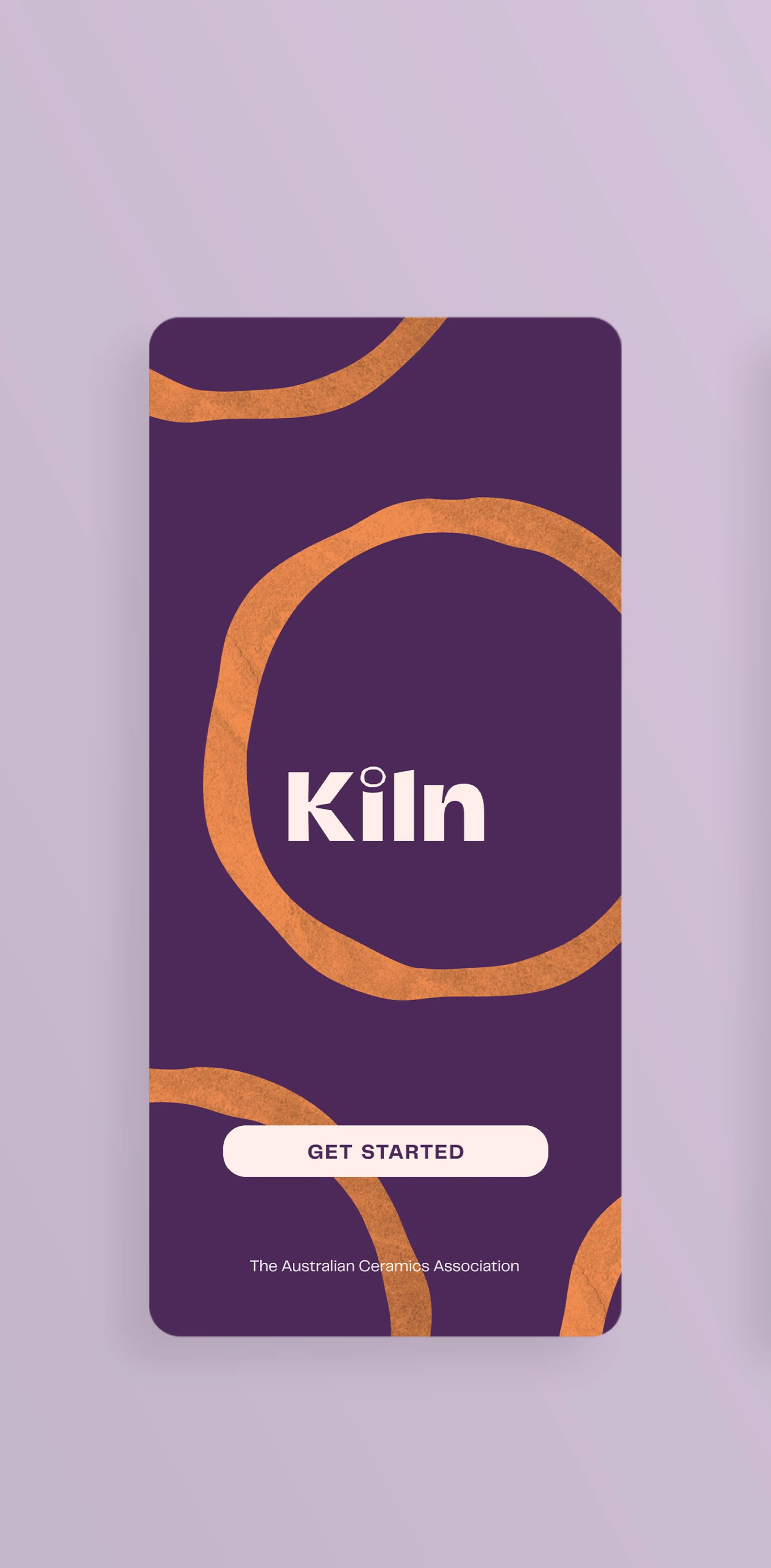
Kiln
Overview
Role: UX/UI Designer
Led visual/UI design
Collaborated on UX and research
Team: 4 design collaborators
Timeline: November 2021 (3 weeks)
Deliverable: Mobile prototype for TACA, an Australian nonprofit supporting ceramicists
Kiln was designed to help The Australian Ceramics Association (TACA) reach a younger audience by making it easier to find and book pottery classes, explore tutorials, and join a welcoming creative community.
Concept work for a student project.
Background
Problem space
TACA wanted to modernize their offerings to:
Foster a community for pottery enthusiasts, connecting them with studios and events
Educate budding, young ceramicists
Encourage more ceramicists to join TACA
User goals
Through research and user persona work, we found users primarily wanted to:
Find and book local classes easily
Spend creative time with friends or family
Learn pottery techniques through videos or demos
Our MVP focused on meeting these goals with a clear, intuitive class booking flow and calming visual direction.
Research
Research methods
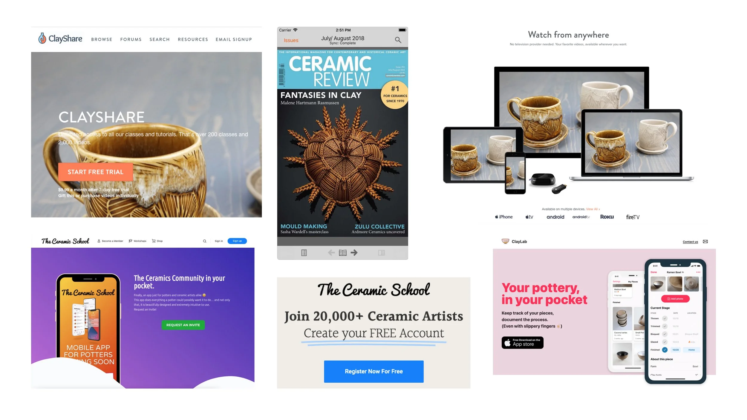
Competitive analysis
User persona development
Key insights
Most existing tools were designed for older, experienced ceramicists.
There is no existing easy, centralized way to find in-person classes or local events.
Newcomers, especially younger artists, wanted apps that felt light, casual, and fun.
UX Design
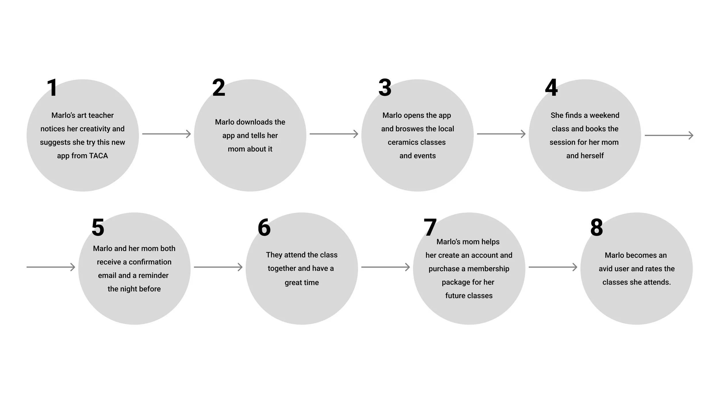
User Journeys
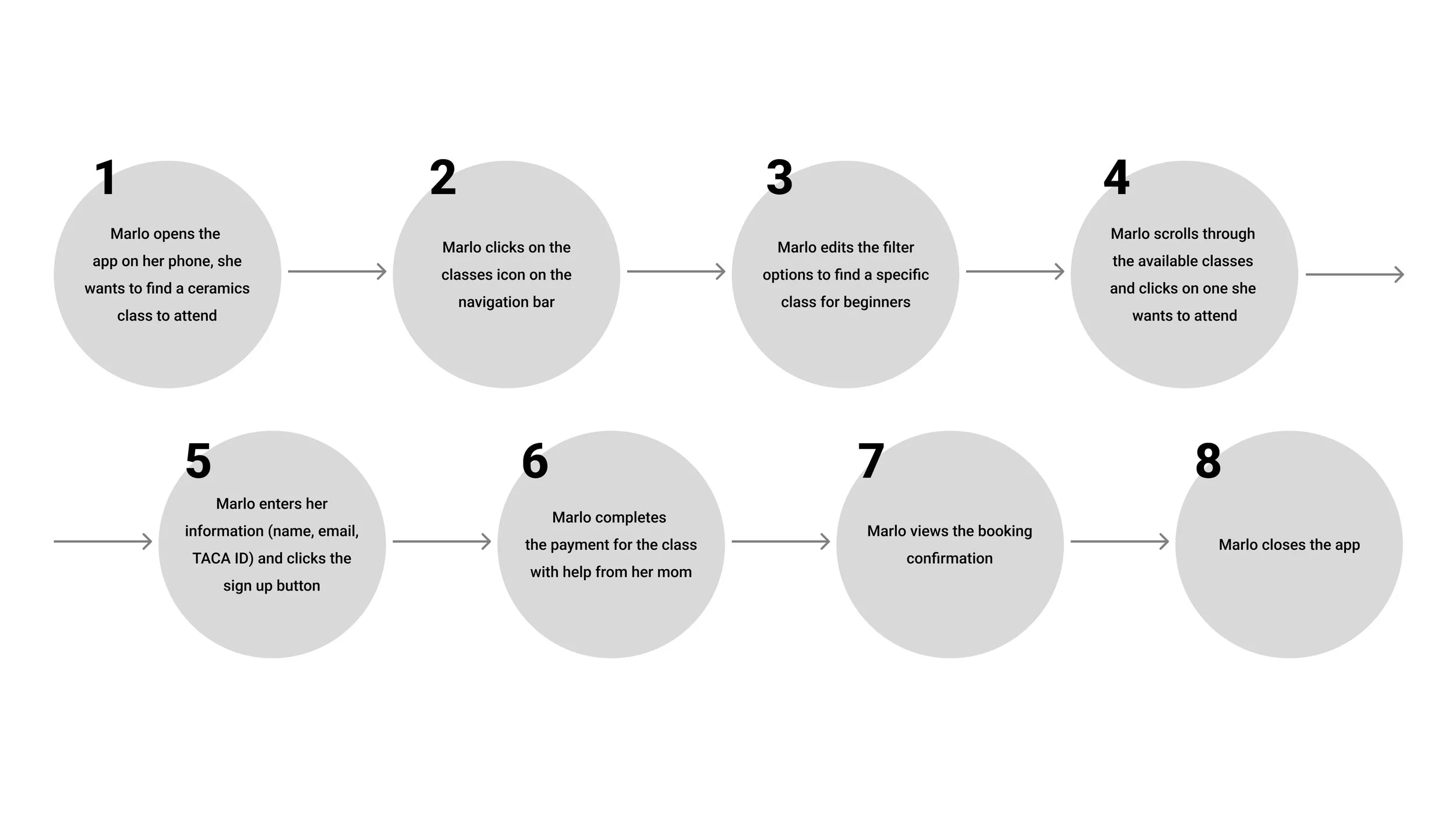
We mapped out our user persona’s end-to-end journey searching for ceramics classes to identify pain points and design opportunities.
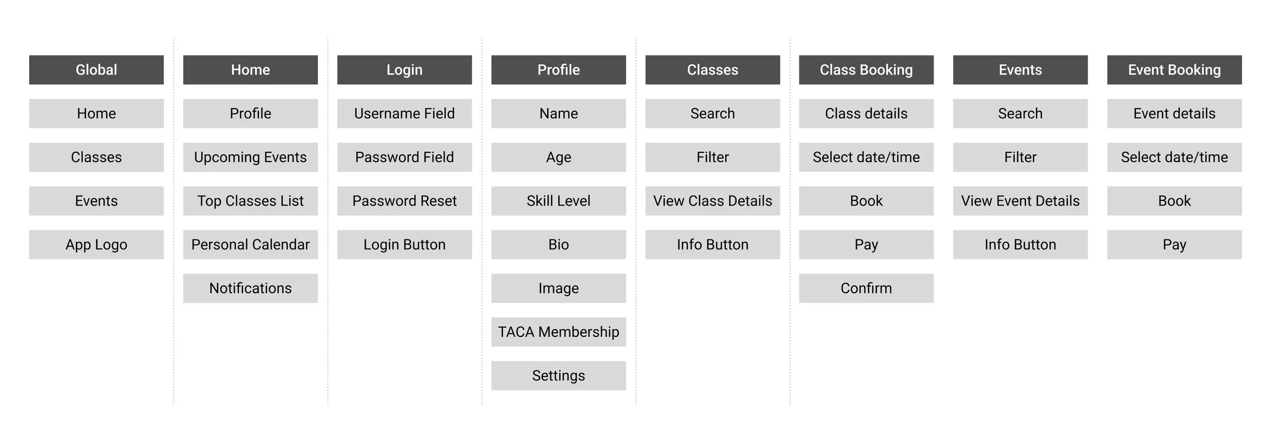
Card Sorting
We divided the user journey into key features and organized them according to their functions. This will help us define what pages, forms, and features we need in our application.
User Flows
We mapped out more specific user flows to hone in on particular interactions and user goals, such as the minute details of finding and booking a class.

Thumbnails
This is where I began operating independently. I sketched and ideated how the features identified in our user flows would appear on a mobile screen. I realized we needed some repeatable components such as lists of classes, class pages, checkout forms, confirmation alerts…
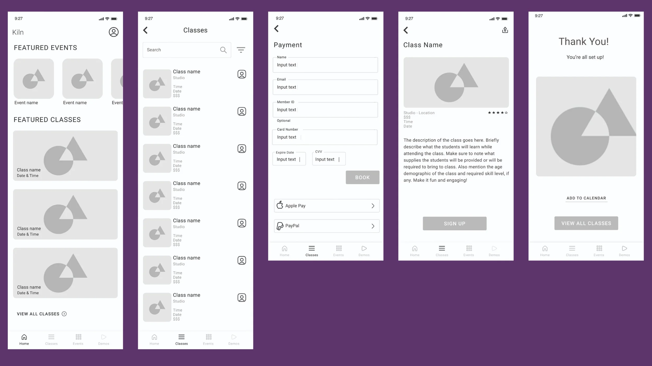
Wireframes
After collecting feedback on my thumbnails, I wireframed some different options so I could have low-fidelity mocks to test with users and start building a design system.
Usability Testing
User feedback
Tap targets felt cramped
Text was hard to read on image backgrounds
Body copy was too small to be reliably legible
Resulting changes
Increased spacing and padding throughout
Added scrims and improved contrast
Refined type hierarchy for readability
UI Design
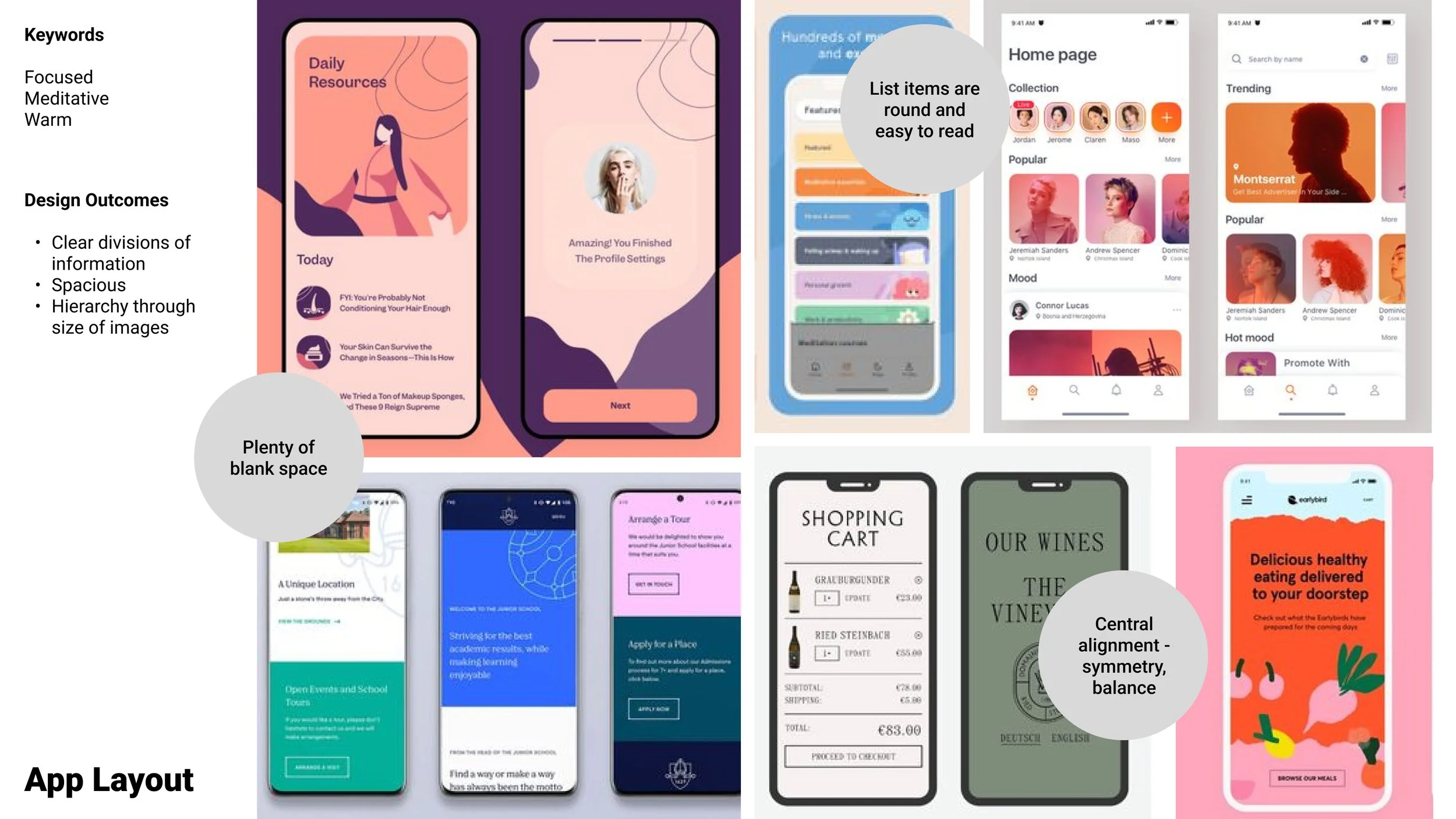
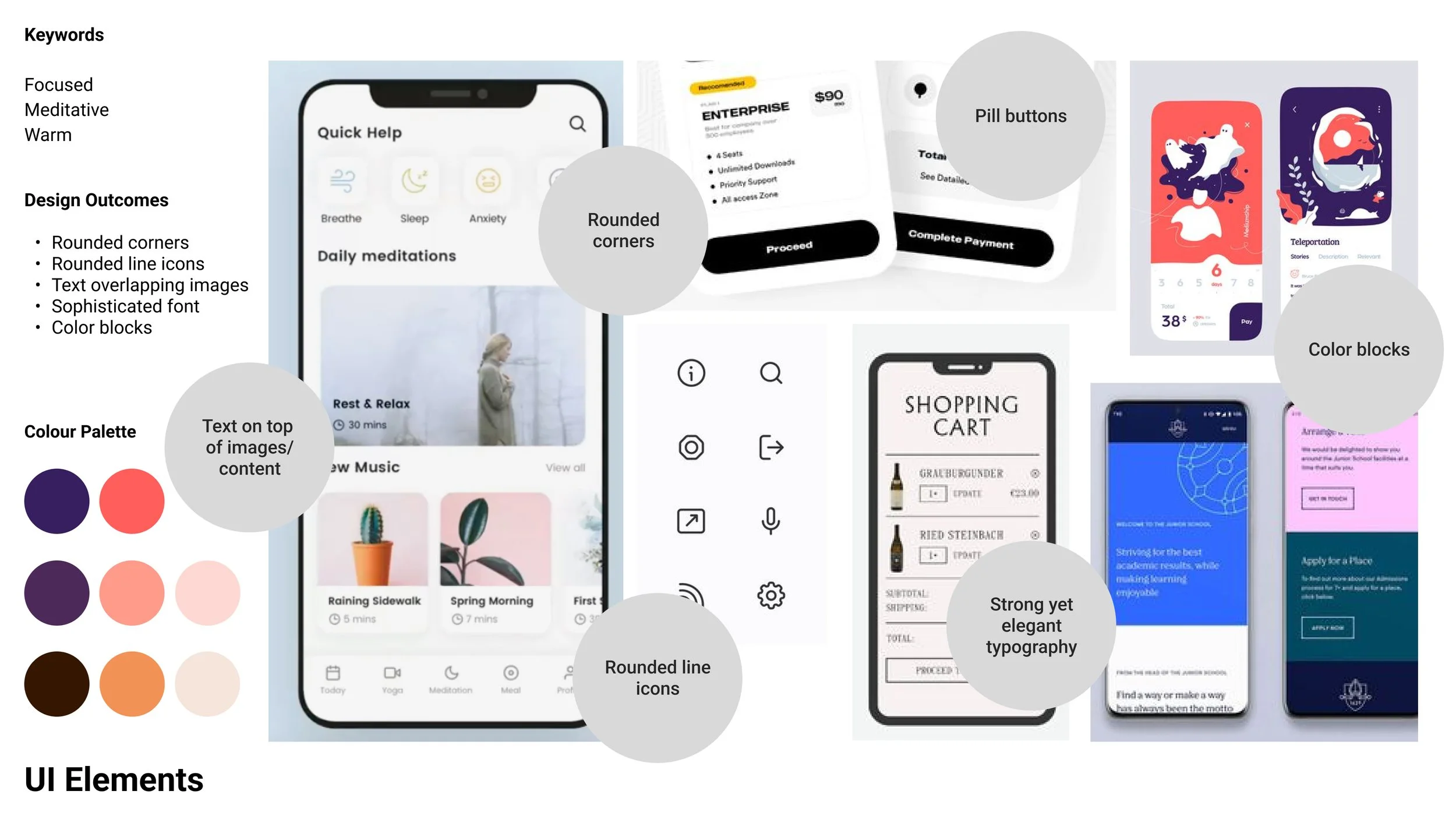
I focused on creating a warm, meditative visual system that would make newcomers feel supported and inspired.
Rounded corners and icons for softness and approachability
Muted clay-inspired colors to reflect the craft
Playful typography to signal creativity, not rigidity
Inspired by meditation apps, where focus and calm are prioritized
Outcome
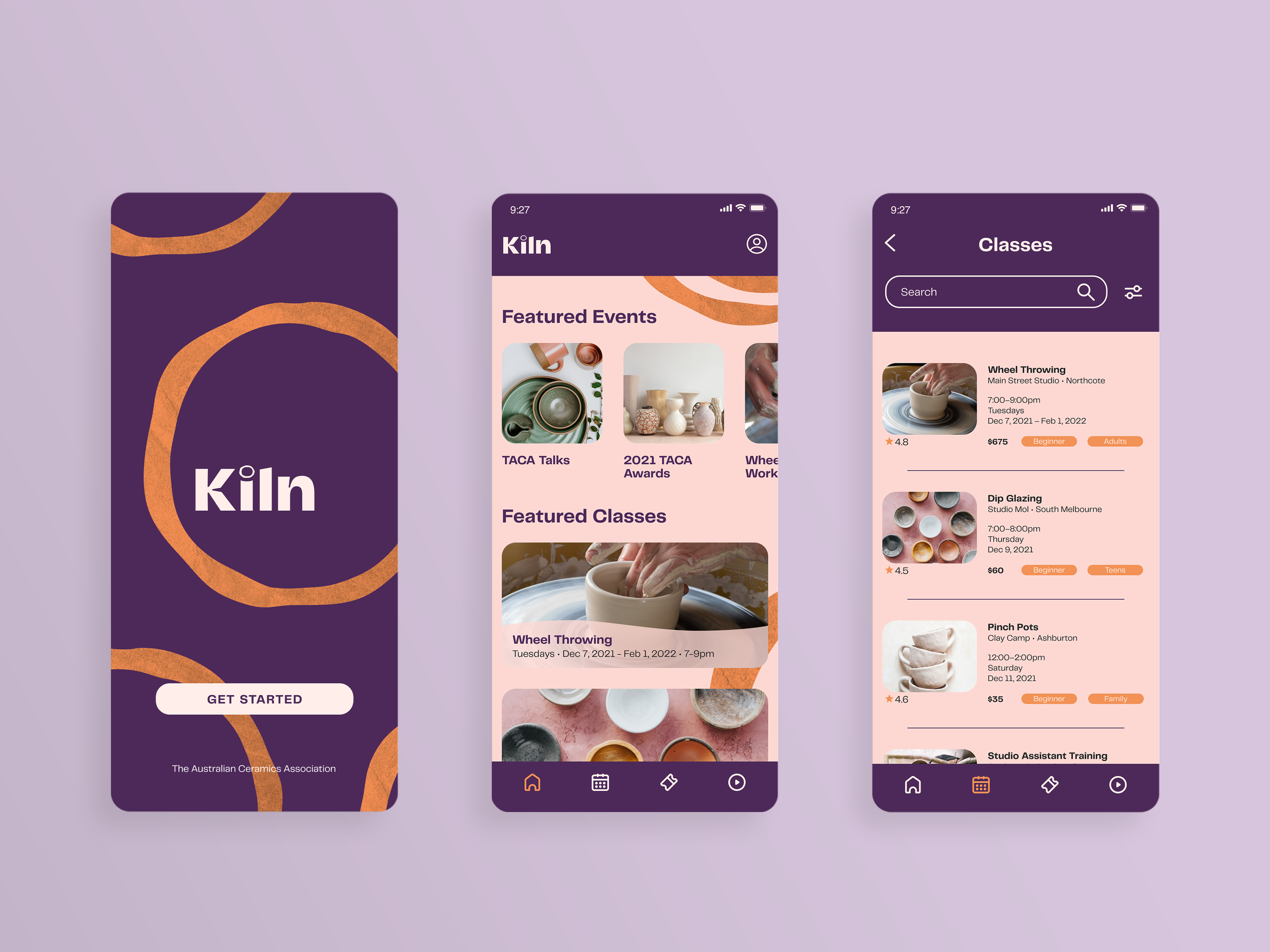
I delivered a fully interactive mobile prototype that lets users:
Discover nearby pottery classes
Filter by day, location, or skill level
Preview class details and book in a few taps

Reflection
Next steps
Add Tutorials and Events sections, as users requested.
Implement analytics to track:
Booking rates and drop-off points
Growth in TACA memberships
App usage by age group
Continue testing with target users.
Reassess UI decisions to align better with native mobile practices.
Reconsider color palette based on accessibility standards.
Personal lessons
Testing and collecting feedback early on is so important! I can collect effective feedback even from thumbnails and wireframes.
Designing for younger users means balancing simplicity with delight and aesthetic relevance.
I can lean on existing mobile design standards when I’m experiencing “analysis paralysis.”