An ad format for small businesses that blends auto-generated video and Google Maps to engage local customers, now with 18% less visual clutter

Local Campaign Ad Format
Overview
Role: Interaction Designer
Company: Google (Display Ads)
Team: 1 Design Lead, 1 Designer (me), 1 User Researcher
Timeline: March – June 2022
Deliverable: A refreshed mobile and web ad format for Google Display Ads (GDA), optimized for small businesses targeting local customers.
Small and midsize businesses (SMBs) often rely on foot traffic and local awareness but lack the tools and budget to create high-quality digital ads. I helped design an ad experience that automatically features local landmarks and business info in a clear, trustworthy layout, incorporating both video and map elements.
Note: All advertiser information and Google Maps data shown below are mock assets.
Background
Problem space
GDA was exploring ways to combine auto-generated videos (AGVs) with Google Maps in local ad campaigns. The goal was to give small businesses:
A way to quickly generate visually engaging ads.
An ad format that feels familiar, local, and trustworthy.
A lightweight layout that doesn’t feel overwhelming.
Project goals
Help SMBs attract local customers through templated, automated ad formats.
Appeal to local customers with engaging, animated assets.
Rework the initial design concept by applying insights from user research to improve usability and visual clarity.
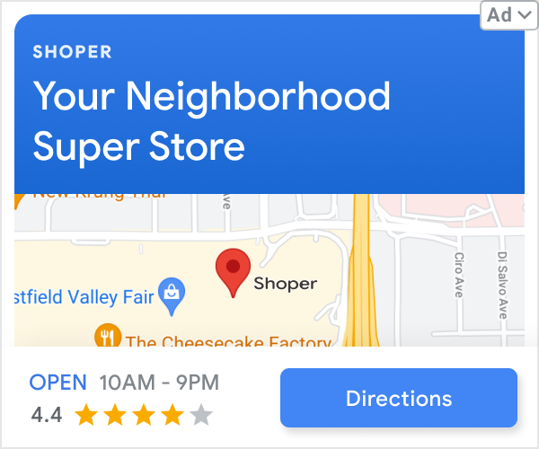
Original design
User research
Key insights
GDA performed user testing with an initial draft of this ad format. In this version:
The video played first, then faded to reveal the local map.
The format was responsive across square and interstitial layouts.
The format had a bold header that incorporated brand colors.
From user testing, we learned:
Users wanted larger, more detailed maps.
Familiar landmarks increased trust and relevance.
The videos were engaging and informative.
Association with Google Maps UI improved perceived credibility.
The layouts felt cluttered and confusing.
Hypothesis
If we enlarged the map and made the layout more familiar and clean, users would:
Better comprehend the ad’s local relevance.
View the ad as more trustworthy since it would more accurately reflect the familiar Google Maps UI.
Find the experience less cluttered since we would eliminate or minimize other elements to focus attention on the map.
Design
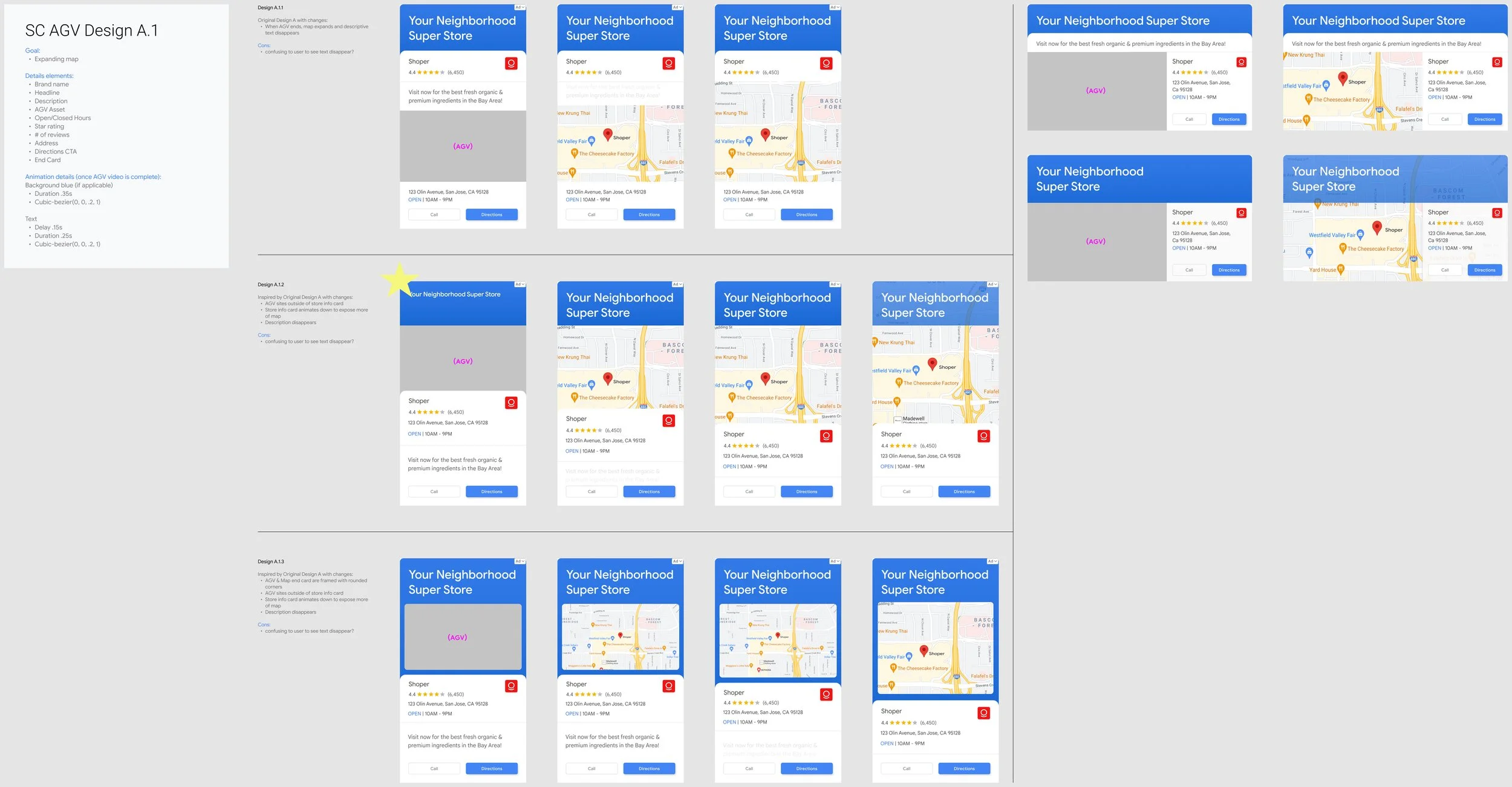
Iterating
My approach
This is where I took over the design process. My goals:
Increase map visibility throughout the ad experience.
Reduce clutter without losing essential content.
Bring in familiar Google Maps visual elements for credibility.
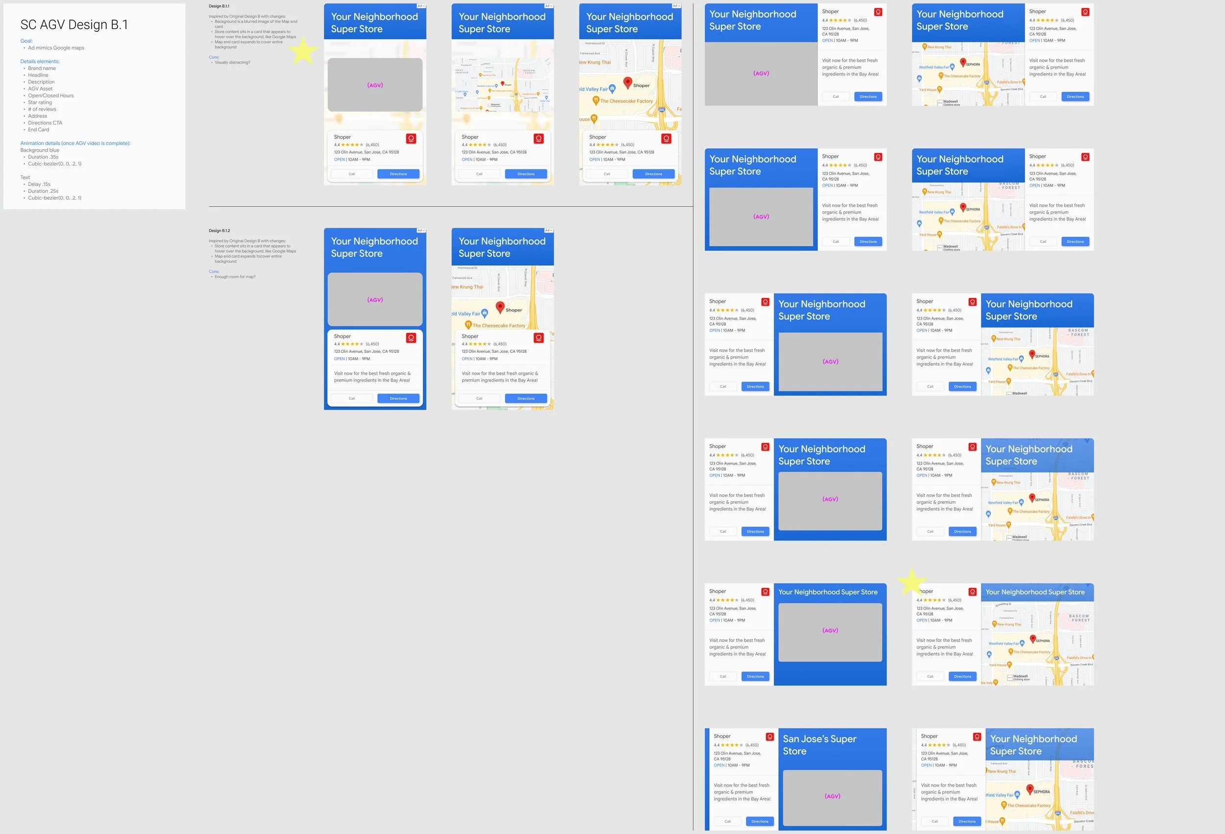
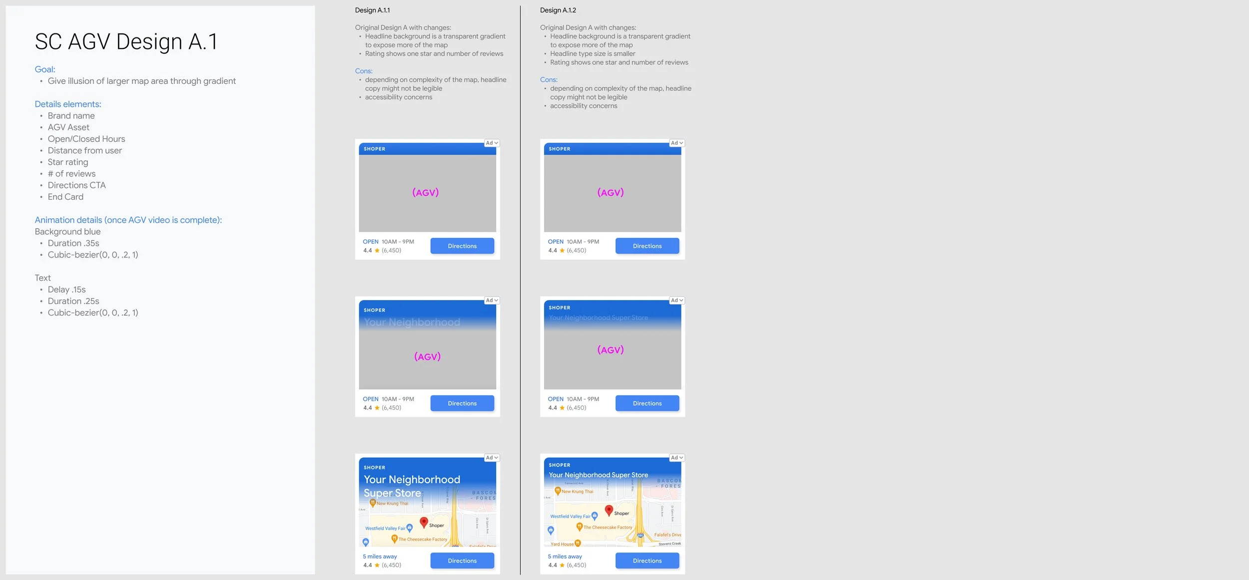
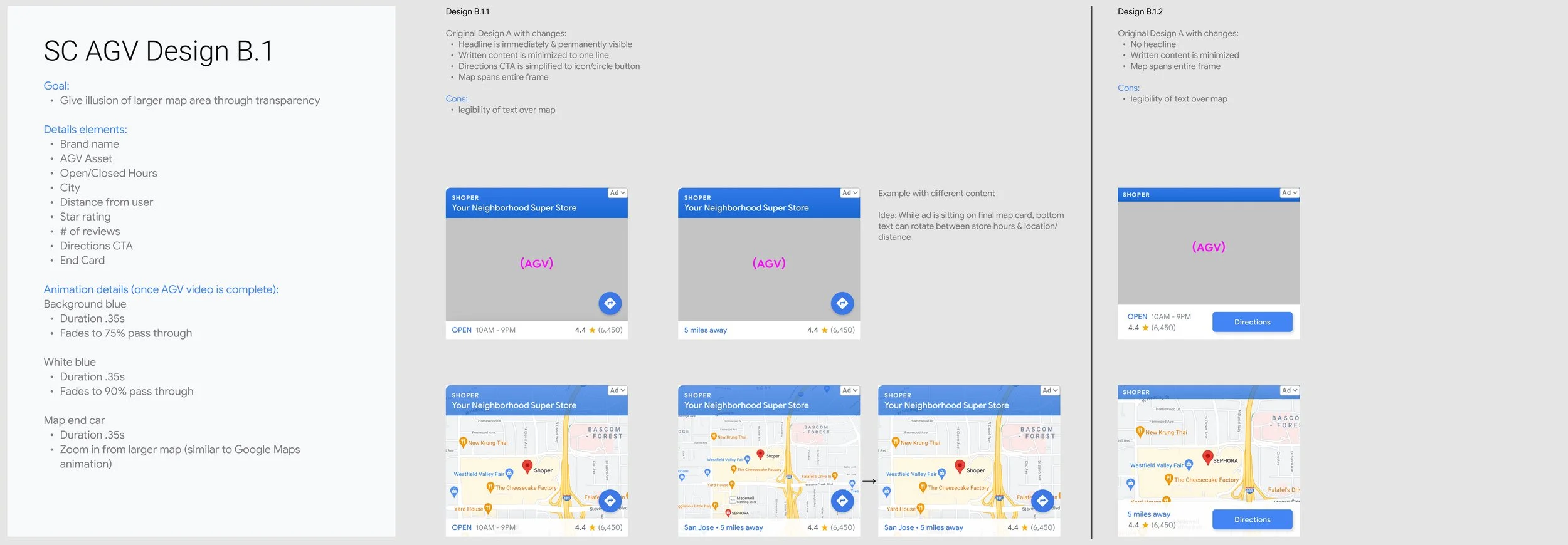
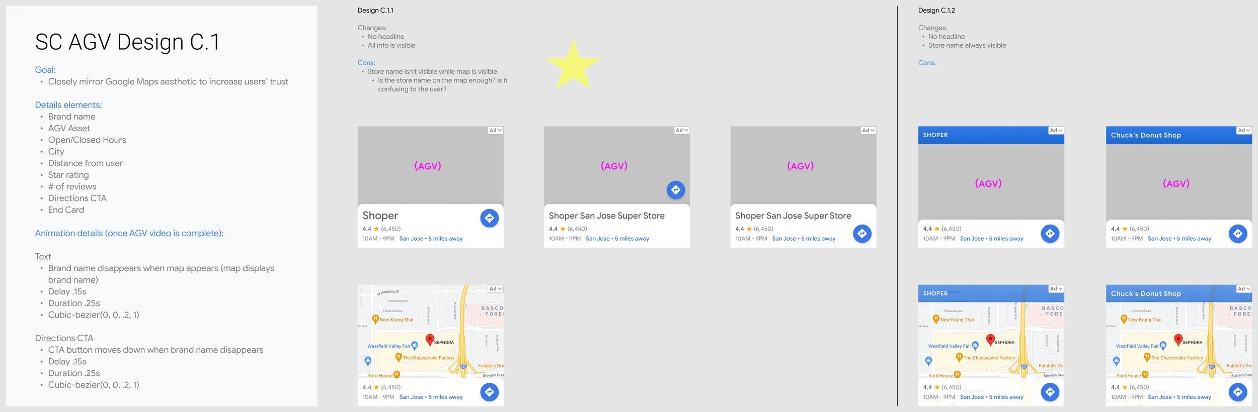
Design changes
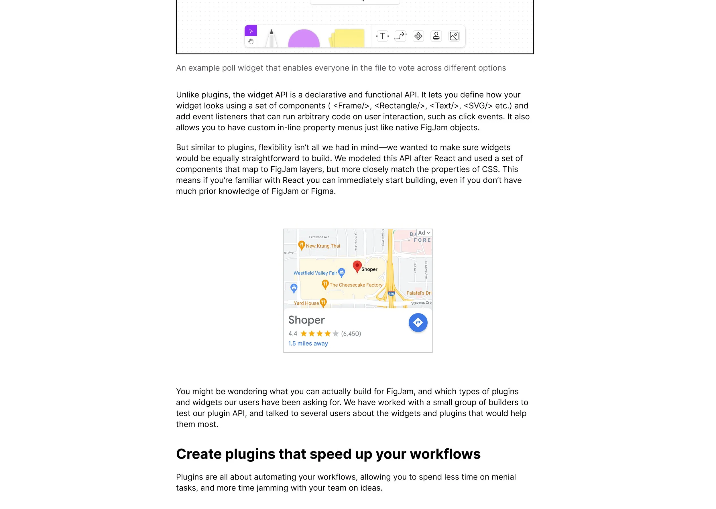
Removed the headline to free up space for the map.
Blurred the map in the background while the video plays, so users know it’s a local ad from the start, but aren’t visually overwhelmed or distracted.
Simplified the copy to improve scannability.
Matched UI elements to Google Maps components (pins, labels) to improve trust and recognition.
A peek into my process
User testing
We tested the new layout in a controlled study with a similar audience.
Users reported the ad felt 18% less cluttered.
It was also perceived as:
Slightly less confusing and less distracting.
Slightly more modern, more visually appealing, and more understandable.
We presented the ads to users as they would come across them in the wild: in the middle of articles or while playing a mobile game.
Outcome
The final design helped Google Display Ads:
Create a more streamlined, modular format for local campaigns.
Increase users’ ability to recognize the business location and engage with the ad.
Deliver a flexible system that works across web and mobile, video and map.
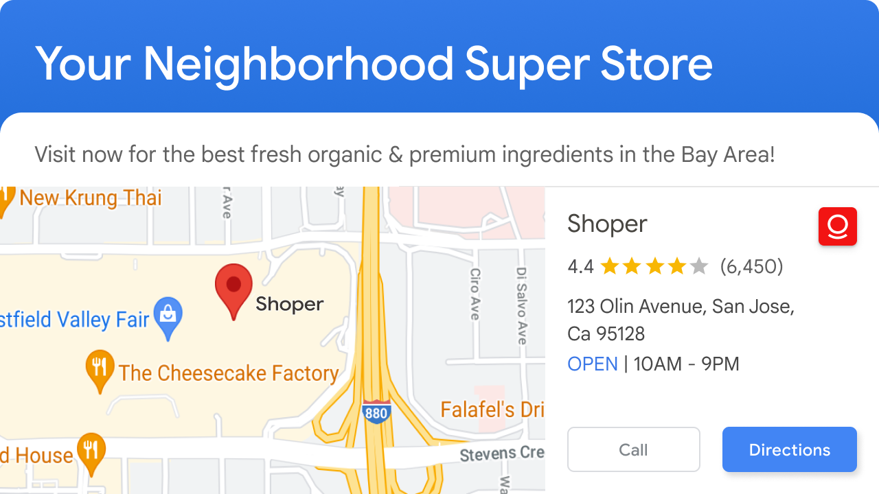
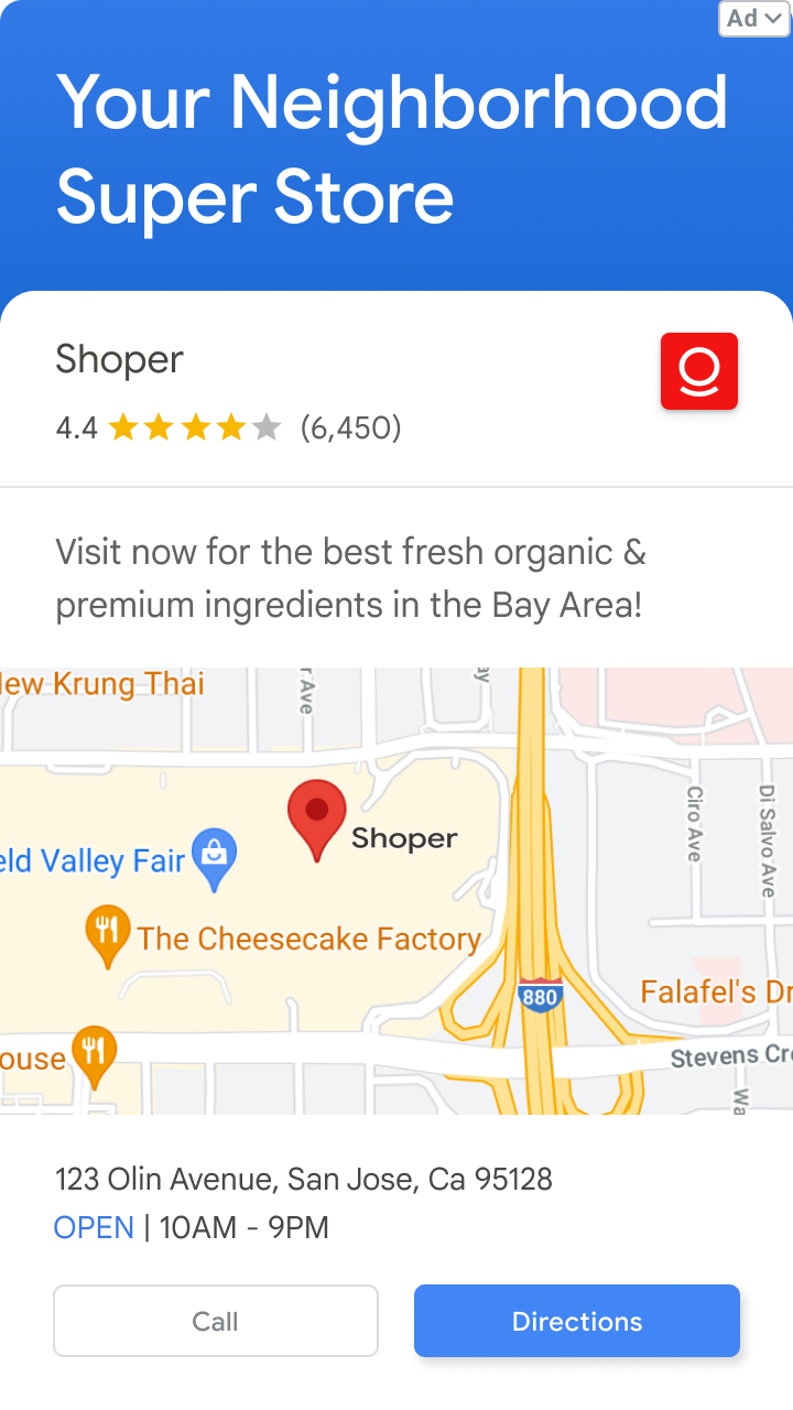
Square web format
Portrait mobile format
Landscape mobile format
Reflection
Next steps
Map detail optimization
Users responded well to recognizable landmarks. We can fine-tune which details are shown (e.g., hiding irrelevant roads, emphasizing nearby stores).AGV storytelling and pacing
The auto-generated video content has huge potential for variation. We can explore:Narrative structure
Text and motion rhythm
Visual tone and transitions
Personal lessons
Small layout changes (like map sizing and text weight) can impact perception, even if the surrounding content remains consistent.
Trust and clarity are especially important when designing ad formats with unfamiliar behavior.
Merging video and map content requires balancing motion, hierarchy, and pacing.
Iterative user research is so valuable! I learned how to quantitatively measure qualitative criteria.